This article explores practical strategies and advanced techniques for improving web page load times. We explore hands-on methods to fine-tune performance and ensure fast, reliable experiences across device types. Whether dealing with a legacy codebase or starting from scratch, the following are actionable steps to optimize a website's speed.
How to optimize website performance—Summary of best practices
Test page performance
The first step towards solving any problem is knowing what to solve. Google Core Web Vitals are standard page performance metrics. We give the main ones below.
Although not a core web vital, Total Blocking Time (TBT) is another key metric that predates INP and helps you measure how long the main thread is blocked during page load. Certain instances, especially in a lab environment where measuring INP directly is more difficult, TBT can be a helpful indicator of potential INP issues.
{{banner-42="/design/banners"}}
However, it’s important to remember that while TBT may be a reasonable proxy metric for INP for the lab, it’s not a substitute for INP in and of itself. TBT might flag problems that don’t actually affect users, and it can miss issues that arise from specific user interactions. To truly understand your website’s responsiveness, measuring INP in the field with real user monitoring (RUM) is essential.

Optimizing for the above listed metrics can also help you significantly improve your overall SEO rankings. You can use Lighthouse and Webpagetest to measure your performance while developing your website or in real-time.

Lighthouse also evaluates different webpage aspects, including metrics like minimizing main thread work, reducing JavaScript execution time, and addressing high Largest Contentful Paint (LCP) scores. These insights serve as a valuable guide and a first step towards optimizing website performance effectively, with additional recommendations discussed later in the article.

Optimize images
Images play a vital role in today’s websites, significantly boosting user engagement and visual attractiveness. However, they can also be the most significant factors in webpage size and bandwidth consumption, adversely affecting loading speed, particularly on mobile devices or slower internet connections.
<img> tag has been around for a long and leveraging its capabilities is important to optimize your Core Web Vitals. For example,
Make sure every image tag has dimensions
Ignoring dimensions causes layout shifts, and the browser may be unable to reserve space before it loads. It can be the biggest cause of a large Cumulative Layout Shift
<img src="flower.jpg" alt="A beautiful flower." width="400" height="400">Optimize for device type
Configure the <img> tag to either lazy-load or provide a responsive image version best suited for the device’s display. Applying responsive image methods, like srcset, enables the browser to select the optimal image size based on the device’s display. This can improve Largest Contentful Paint (LCP)
<img src="image.jpg" srcset="image-480w.jpg 480w, image-800w.jpg 800w, image-1200w.jpg 1200w" sizes="(max-width: 600px) 480px, 800px" alt="Responsive image">Use the <picture> tag
You can also use the <picture> tag to select the appropriate image based on the display characteristics, such as screen size and resolution.
<picture>
    <source srcset="keyboard.avif" type="image/avif">
    <source srcset="keyboard.webp" type="image/webp">
    <source srcset="keyboard.jpg" type="image/jpeg">
    <img src="keyboard.jpg" alt="Omg a keyboard">
</picture>
{{banner-34="/design/banners"}}
Compress images
Image compression (e.g., Sharp, ImageOptim, or an image CDN or Imagemin) should be applied using a modern image format.
/* Images can be consistently optimized by integrating Imagemin into the workflow, ensuring they load quickly and efficiently */
import imagemin from 'imagemin';
import imageminJpegtran from 'imagemin-jpegtran';
import imageminPngquant from 'imagemin-pngquant';

const files = await imagemin(['images/*.{jpg,png}'], {
	destination: 'build/images',
	plugins: [
		imageminJpegtran(),
		imageminPngquant({
			quality: [0.6, 0.8]
		})
	]
});

console.log(files);
//=> [{data: <Uint8Array 89 50 4e ...>, destinationPath: 'build/images/foo.jpg'}, ...]
Modern image formats like WebP or AVIF help the browser pick an optimal image size for the device’s screen, offering enhanced compression and quality. Conversion from JPEG to AVIF can achieve a staggering 84% reduction in file size. Google’s Squoosh tool provides an accessible way to convert images to these updated formats.

Optimize source code
Even with optimized images, large or inefficient code can delay how quickly your content appears on the screen and hinder interactivity. Here are some of the ways how you can optimize your web performance from a source code perspective:
Avoid DOM depth
DOM depth refers to the number of nested elements within the HTML structure. Excessive nesting increases rendering time and impacts responsiveness.
/* Example too nested DOM Structure */
<div class="container">
 <div class="header-wrapper">
   <div class="header">
     <h1>Welcome to Our Website</h1>
     <div class="header-content">
       <p>Your go-to platform for everything tech!</p>
     </div>
   </div>
 </div>
 <div class="main-content">
   <div class="content-wrapper">
     <section>
       <article>
         <div class="post">
           <h2>Latest Post</h2>
           <div class="post-content">
             <p>Stay updated with the latest in tech.</p>
           </div>
         </div>
       </article>
     </section>
   </div>
 </div>
</div>
<!-- Optimized, shallow DOM structure -->
<div class="container">
<header>
<h1>Welcome to Our Website</h1>
<p>Your go-to platform for everything tech!</p>
</header>
<main>
<section>
<article>
<h2>Latest Post</h2>
<p>Stay updated with the latest in tech.</p>
</article>
</section>
</main></div>{{banner-37="/design/banners"}}
Use the content-visibility CSS Property
Setting content-visibility auto-defers the rendering of elements until they enter the viewport. It reduces initial load times, especially for pages with a large amount of hidden or below-the-fold content. Pair the contain-intrinsic-size property with content visibility to provide an estimated height and avoid layout shifts. This combination optimizes performance by deferring rendering while maintaining layout stability.
/* Applying content-visibility to a section */
.lazy-section {
  content-visibility: auto;
  contain-intrinsic-size: 1000px; /* Placeholder size to prevent layout shifts */
}
Limit CSS complexity
Complex CSS rules with deeply nested selectors or excessive animations increase rendering time and contribute to DOM bloat. Limit the depth of CSS selectors and reduce the use of complex pseudo-classes. Use more straightforward, more direct selectors to improve CSS efficiency.
/* Complex and inefficient */
section div.article p span {
  color: #333;
}

/* Simplified, efficient */
.article-text {
  color: #333;
}
Optimize using async operations
Asynchronous operations such as async/await, setTimeout, and Promises enhance web speed and overall performance. They allow tasks to run without blocking the main execution thread, making them particularly effective for handling time-consuming processes, such as data fetching or loading resources.
Bundle source code
Bundling combines multiple files, such as JavaScript and CSS, into one file to reduce browser requests. This minimizes latency, improving load times and enhancing overall performance. Bundling can be done using one of the available open-source libraries (Webpack, Browserify) and can be integrated with your build process.
Implement lazy loading
Lazy loading delays the loading of non-essential elements, like images and videos, that aren’t required right away. This method improves a page's initial load time. Modern browsers support lazy loading via the loading attribute for HTML.
<img src="image.jpg" loading="lazy" alt="Description">
<iframe loading="lazy" src="video-player.html" title="..."></iframe>
Track console errors and remove redirecting calls
JavaScript errors can disrupt functionality, leading to user frustration. Resolving these errors ensures smooth interactions, faster loading times, and better cross-browser compatibility.
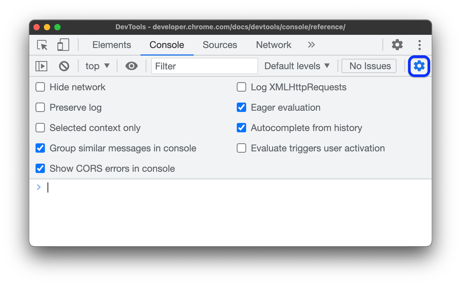
However, real-time errors on your webpage can be more complicated. Implementing a comprehensive error-tracking solution can be beneficial. Tools like Errbit offer real-time insights into errors occurring within web applications and provide detailed reports that include stack traces and user context Another powerful option for tracking errors and front-end performance is Catchpoint’s RUM that gathers data from actual user sessions to provide a realistic view of performance and JavaScript errors across diverse devices, browsers, geographies, and network conditions.
Temporary redirects (302) are sometimes unintentional and can slow performance by requiring an extra HTTP request cycle. Confirming and optimizing server configurations is essential to reduce unnecessary 302 redirects on a server.
{{banner-39="/design/banners"}}
Compress and minify your code.
Larger files delay downloads and rendering, affecting user experience and engagement. Some tools for minimizing JavaScript and CSS bundle sizes:
Terser
Terser compresses JavaScript files by removing unnecessary characters and shortening variable names. After minification, a large script can see up to 80% reductions, making it significantly faster to download and render.
To integrate it with webpack, install the terser-webpack-plugin and include the following code as part of webpack.config.js
const TerserPlugin = require("terser-webpack-plugin");

module.exports = {
  optimization: {
    minimize: true,
    minimizer: [new TerserPlugin()],
  },
};
CSSNano
CSSNano minimizes CSS file size by eliminating whitespace, comments, and unnecessary properties. For large codebases, it can achieve reductions of over 20% in CSS file size.
Brotli and Gzip
Brotli and Gzip are compression algorithms that reduce the size of text-based assets like HTML, CSS, and JavaScript. To add compression to your bundle, install the compression-webpack-plugin and add the following to your webpack.config.js. Brotli yields 14% smaller JavaScript files, 21% smaller HTML files, and 17% smaller CSS files compared to Gzip.
module.exports = {
  plugins: [
    new CompressionPlugin({
      algorithm: "gzip",
    }),
  ],
};
Source: Webpack
{{banner-35="/design/banners"}}
Optimize for multiple devices
Focusing on responsive design, testing across platforms, and employing best practices for mobile usability can enhance both speed and user satisfaction.
CSS media queries
CSS media queries are a way to provide a responsive design. In the example below, the query ensures that the website adopts a screen size of up to 768px.
@media (max-width: 768px) {
    .container {
        display: flex;
        flex-direction: column;
    }
}
However, modifying every component can take time.
Tailwind CSS or Bootstrap
You can also use Tailwind CSS or Bootstrap to design responsive components for your web. Tailwind offers a utility-first approach and includes responsive classes like sm:, md:, lg:, and xl: to adjust styles for different screen sizes. It lets you control responsiveness directly through class names. Bootstrap offers a grid system and class names for various screen sizes. This can help you avoid custom CSS media queries.
Testing
Testing is the best way to determine whether your website is responsive on multiple devices. If you know your user pool, you can check the interactivity on the phone or use built-in developer tools to test for responsiveness. Catchpoint’s Real User Monitoring (RUM) and Synthetic Monitoring tools also support cross-browser monitoring, ensuring consistent performance and speed across various user environments. This method offers an in-depth view of user experience, making detecting and resolving any speed-related issues easier.
Caching
Depending on how often it changes, content can be cached in a browser, CDN, or API gateway.
- Browser caching is ideal for highly static or user-specific assets, especially when reducing network requests and latency.
- CDN caching is best for frequently accessed, shared content that does not require personalization. It optimizes global access and reduces server load.
- Backend caching is recommended for frequently accessed, dynamic data on the backend.
{{banner-36="/design/banners"}}
HTTP caching
The browser, or HTTP cache, saves a response linked to a request and uses that saved response for future requests. It is of two types -
- Private Caching - User-specific cache
- Shared Caching - Cache which can be shared among users
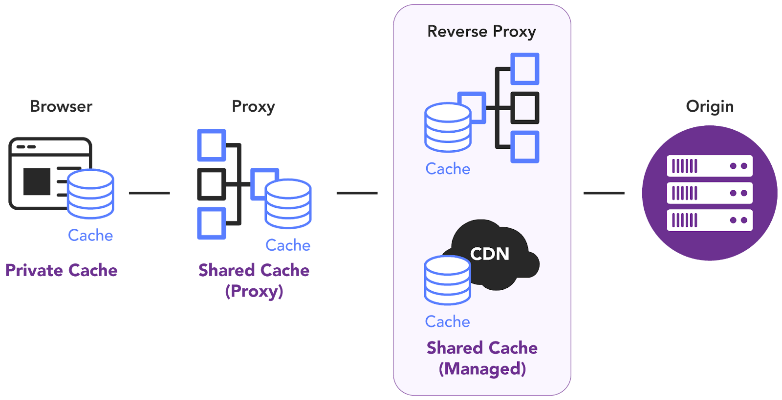
To achieve HTTP Caching, use the Cache-Control header to store both request and response caches. The Cache-Control header holds directives(instructions) with values for caching in browsers or shared caches(Proxies, CDNs). It can contain one or more directives separated by commas:
Cache-Control: directive1, directive2, ...For example:
Max-age = N directive indicates that the response is fresh up to N seconds
Cache-Control: max-age=604800MDN doc lists all the directives that can be used to cache requests and responses.
Backend caching
Dynamic content, by its nature, requires on-the-fly generation, which can be resource-intensive. With backend caching you can bypass this overhead and deliver content much more efficiently. When a user requests the same content (or similar content), the server can quickly retrieve it from the cache instead of repeating the entire process.
To understand better on why processing dynamic content can be slow without caching, consider the following sequence of events.
- User request: A user interacts with your website in a way that requires dynamic content (e.g., browsing products, filtering search results, viewing a personalized dashboard).
- Server-Side processing:
some text- The server receives the request and needs to execute code to generate the appropriate content.
- This often involves fetching data from a database, performing calculations, applying business logic, and formatting the output.
- Time cost: All of this processing takes time, which can translate into noticeable delays for the user, especially if:
some text- The database queries are complex.
- The datasets are large.
- The server-side logic is computationally intensive.
- Impact on user experience: Slow loading times can lead to a poor user experience, increased bounce rates, and lower conversion rates.
It is, however, important to note that data that changes frequently might not be suitable for caching; instead computationally expensive results or frequently accessed data are ideal for caching.
There are various types of backend caching:
- Database caching for optimizing the database itself to store frequently accessed data in memory for faster retrieval.
- Server-side caching using tools like Redis or Memcached to create a dedicated caching layer between your application and database. With generated content stored in a cache, the server can skip steps to execute code every time and deliver the pre-generated content directly.
- API caching of responses from your APIs reduces the need to make repeated external requests. The data can also be served quickly, even if the external API is temporarily unavailable.
CDN caching
Content delivery networks (CDNs) are essentially giant, distributed caches for storing copies of your website’s assets like images, stylesheets, and scripts to deliver web content faster. CDNs are best suited for caching static, immutable assets with high traffic and global reach, rather than dynamic or personalized content.
When a user requests content from your website, the CDN intercepts the request and then delivers that content from the edge server closest to the user. The proximity to the user reduces latency and improves performance and reliability by minimizing the distance between users and servers through Points of Presence (PoPs).
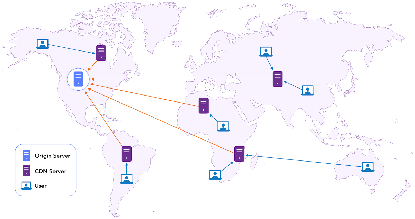
CDNs are particularly useful for
- Image optimization
- Lazy loading
- Serving static assets
- Improving performance metrics like LCP and INP by minimizing latency.
- Pre-rendering
- Caching dynamic content
Limit and optimize network requests
Reducing HTTP requests decreases load times and improves overall responsiveness. Asynchronous loading enables scripts to load independently without hindering the rendering of the rest of the webpage. While an async script downloads, the browser can continue processing other document elements, improving page load speed.
HTTP/1.x
If using HTTP/1.x for multiple TCP connections, requests often need to be parallelized due to head-of-line blocking, where each resource is fetched sequentially over a single connection. This leads to inefficient resource fetching, especially when dealing with numerous small assets.
Concatenation and domain-sharding techniques limit network requests in HTTP/1.x. The downside of using multiple domains though is the increased number of DNS lookups, which can negatively impact initial page load speed.
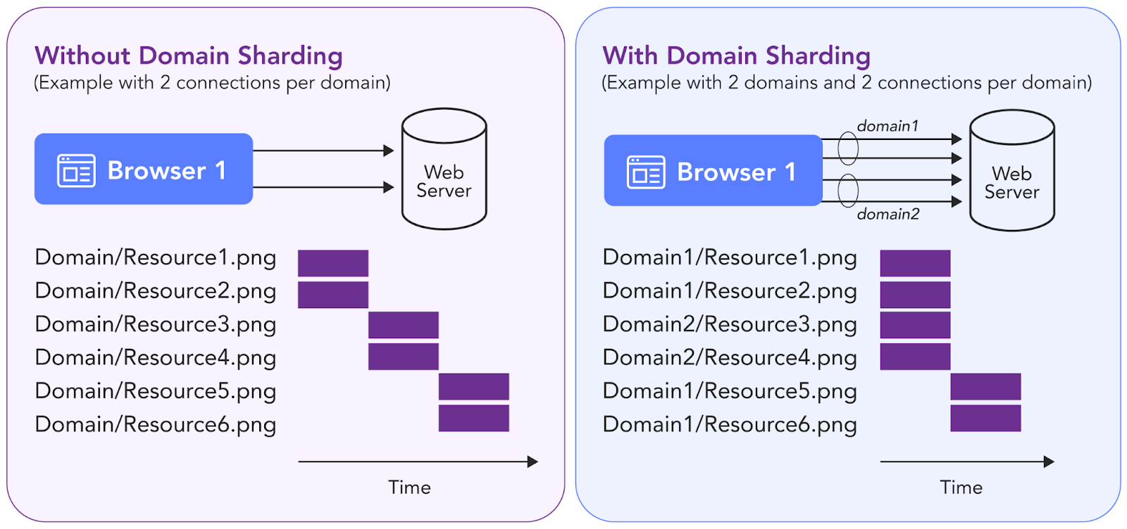
Domain sharding improves page load times by distributing requests across multiple subdomains, bypassing the browser's connection limit per hostname.
HTTP/2.x
Upgrading to HTTP/2.x offers key benefits. Its multiplexing feature lets multiple requests run simultaneously over a single connection, solving head-of-line blocking issues. Additionally, HTTP/2 uses binary framing for improved parsing and lower overhead. Enabling HTTP/2 on the web server allows websites and apps to download faster without changing the existing code.
Optimize APIs
API optimization is essential to maintain quick response times, manage traffic efficiently, and reduce resource consumption, especially when slow performance impacts scalability, high P99 latency (99th percentile latency) delays, or affects user experience and conversions. Optimization is also vital for APIs that rely on slower third-party services, experience timeouts, or handle long-running requests.
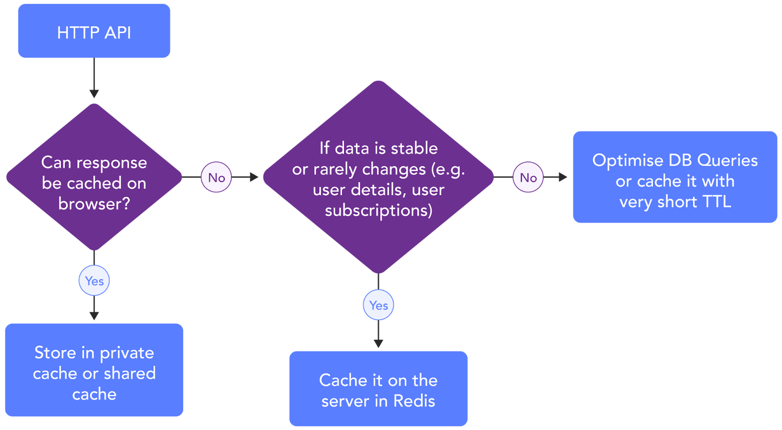
Focusing on P99 latency, or the response time for the slowest 1% of users, is critical for delivering reliable, responsive service across all user interactions. By optimizing this metric, API performance remains more consistent, enhancing usability even for those with slower connections or high-traffic scenarios.
Pre-render web pages/resources
Prerendering, commonly called Static Site Generation (SSG), represents how pages are rendered to static HTML files during the build process. It maintains the same performance benefits of server-side rendering (SSR) but achieves a reduced Time to First Byte. SSG is best for content that doesn't often change, such as e-commerce catalogs and event websites.
Static site generators are applications that convert templates, components, and content sources into the HTML, CSS, and JavaScript files required for a website. Several frameworks also support SSG, including:
- Next.js: A React framework that provides server-side rendering and SSG for dynamic and static content.
- Gatsby: A React-based framework focused on building static sites with extensive plugins.
- Nuxt.js: A Vue.js framework supporting SSG and server-side rendering.
- Hugo: Written in Go, Hugo is a high-speed static site generator, especially effective for large sites.
- Jekyll: Ruby-based SSG, frequently paired with GitHub Pages for simplicity and easy deployment.
- Vite: Primarily a fast-build tool with SSG capabilities via plugins like Vike.
These frameworks help developers create efficient, fast-loading static websites with various customization options.
Enable auto-scaling, rate limiting, and use of virtual waiting room
If your application is primarily static, deploying it on a CDN is generally the best choice. A CDN efficiently delivers static files like HTML, CSS, and JavaScript by serving them from locations closer to your users, which improves speed and reliability.
However, if your app requires server-side interaction, using a load balancer in front of your backend services is ideal. Set up the load balancer to handle requests with a round-robin approach or, if needed, a custom algorithm that routes requests based on user or application logic. Auto-scaling can further help by automatically adjusting server capacity as traffic fluctuates, though keep in mind that auto-scaling has limits.
To optimize the use of your resources and prevent downtime, rate limiting is essential, especially during periods of heavy traffic. Rate limiting can be applied based on session tokens, IP addresses, regions, or custom business logic. It should be a priority when launching high-traffic campaigns.

Auto-scaling and rate limiting can help avoid unwanted downtime, but to provide a better user experience during peak times, you may also want to implement a virtual waiting room. This temporarily holds visitors in a queue, letting them access your site once capacity becomes available. A waiting room allows users to enter the site in an organized manner rather than overwhelming it. You could implement this feature with Redis or use a cloud-based solution to manage the queue.
Monitor the Internet Stack
The Internet Stack is a collection of services that enable users to remotely access a website. It includes the DNS, CDN, and network services provided by internet service providers (ISP), along with third-party APIs accessed by the website to render a web page with the required data. Collecting measurements from all of the components of the internet Stack gives a complete view of the end-to-end transaction path and the factors degrading the end-user experience.
Network performance is a major contributor to the end-user performance. The traceroute command can help you analyze your webpage's overall latency per network segment and determine which hop along the transaction path takes the most time.
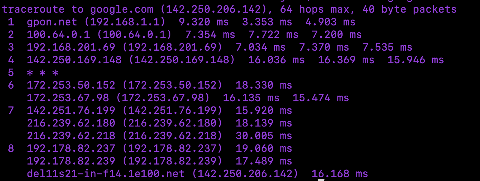
However, traditional traceroute has limitations, such as measuring network performance through load balancers or firewalls. It causes blind spots in the measurements when the website uses a load balancer or is fronted by a firewall. To overcome such limitations, you can use Catchpoint’s InSession traceroute for a broader coverage of possible network configurations between the user and your web servers.
Collecting measurements across the full Internet Stack using an integrated platform like Catchpoint's Internet Performance Monitoring (IPM) provides the visibility needed to identify and resolve bottlenecks that depend on third-party internet service providers. The measurements can be taken using real user transactions by collecting the measurements from the end user browsers (a.k.a., real user monitoring, or RUM) or by emulating transactions (a.k.a., synthetic monitoring) from thousands of points across the globe to ensure reachability and performance from every geography (e.g., Tokyo vs. London) and service provider network (e.g., Verizon vs. Comcast).
Examples of Internet Stack performance problems
Below are a few examples of problems that can occur in the third-party services considered part of the Internet Stack connecting the end-users to your website along the transaction path. This list is not meant to be exhaustive but provides examples of potential issues that can be detected and explains how they can be addressed by collecting such measurements.
DNS issues
High latency in domain resolution time or DNS timeouts might indicate a misconfiguration or a temporary outage in the DNS. To address this:
- Ensure you have a secondary DNS service that can seamlessly replace the primary when it fails.
- Use a DNS monitoring provider to collect real-time measurements and be notified of DNS problems before your users are affected for an extended period.
CDN issues
If CDN monitoring indicates a high cache retrieval latency, a low cache-hit ratio, or inefficient caching, you can:
- Expand your CDN’s geographic footprint and configure it to cache frequently accessed content closer to users.
- Fine-tune your expiration times based on content type and user behavior to balance cache freshness and hit rate.
Session timeout errors
If real-user monitoring shows that sessions time out, it might be due to dropped sessions and insufficient server infrastructure.
Increasing the server count in high-demand regions can distribute traffic more evenly and reduce load, lowering the chance of timeout errors. If timeout errors are frequent, it could indicate an overloaded server. Load balancers can distribute requests across servers, ensuring no single server is overwhelmed.
Network bottlenecks
If network monitoring shows excessive delays between the end users and your servers, evaluate your Internet service provider (ISP). Run traceroutes at regular intervals to confirm the delays within a particular ISP's network and consider switching to a different service provider. Some low-cost ISPs oversubscribe the traffic on their network to save on backbone costs, which results in high latencies during peak hours.
Last thoughts
Start by measuring the Core Web Vitals to understand the problems you must address to improve your website’s performance. After addressing the issues, use Internet Performance Monitoring (IPM) to measure the end-user experience, including all of the components involved in the transaction path between the users and your website.