Blog Post

Catchpoint Custom Visualizations for 2018

Published
January 25, 2018
#
 mins read
By 

in this blog post

One of our key features is the ability to visualize the data any way you want by creating custom visualizations.

Our customers have taken the stock visualizations (Grid, GeoChart, World Cloud, etc.) and modified them to meet their own needs, which have resulted in some really cool views of their data.

In this blog post, we will cover two new custom visualizations that have been created using Google Charts. Google Charts provides an extensive gallery of charts and data tools and is free to use.

First, we’ll look at a stacked bar chart. A stacked bar chart is a graph that is used to break down and compare parts of a whole. Each bar in the chart represents a whole, and the segments within the bar represent different parts or categories of that whole. So, if you wanted to visualize your page size, you might select HTML bytes, image bytes, CSS bytes, font bytes, etc. In this example, we can easily compare different sites and their makeup, e.g.

You can grab a copy of the code directly from GitHub. To create the custom visualization, perform the following steps:

  • Login to the Catchpoint Portal
  • Goto Analysis > Performance
  • Hover over the three dots in the chart type menu
  • Click ‘create visulization’
  • Complete the left-hand side as per the comments in the source
  • Paste the code into the ‘Script’ box
  • Click ‘save’

Now go ahead, select some tests and metrics! As always, if you have any suggestions or improvements then please contact blog@catchpoint.com.

The second custom visualization is based on the Google Calendar chart. This allows for you to easily visualize a single metric for a period of up to one year broken down by day. For example, if you want visualize how your page weight has varied day by day over a year period, you would select the total bytes download metric, e.g.
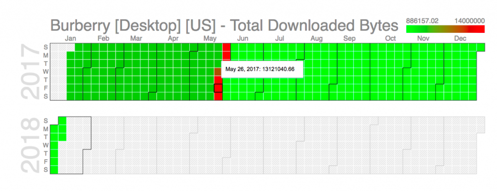
We can very clearly see here that towards the end of May, the page increased significantly but was resolved by June 1, 2017.

Another simple use case would be to view the number of test errors encountered for a given time period, e.g.

Again, you can grab a copy of the code for this visualization from GitHub and follow the steps from the stacked bar chart instructions above to create this new visualisation.

I hope these examples of custom visualizations inspire you to go out and build some intuitive and informative dashboards within our portal.

This is some text inside of a div block.

You might also like

Blog post

Lessons from Microsoft’s office 365 Outage: The Importance of third-party monitoring

Blog post

Preparing for the unexpected: Lessons from the AJIO and Jio Outage

Blog post

Prioritize Internet Performance Monitoring, urges EMA