Blog post
Blog Post
Mobilegeddon: Hidden Effects on Desktop Sites
Mobilegeddon, Google's updated search algorithm, affects mobile sites' rankings, and mobile performance has an impact on desktop sites' rankings as well.
When Google announced their new Mobilegeddon guidelines – a series of mobile-friendly optimization requirements that was supposed to affect websites’ mobile search rankings on Google – the natural inclination for most businesses was to quickly adhere to those stipulations so as not to fall behind the competition when mobile users searched for their sites and keywords.
However, that fear may have been misplaced.
Mobile friendliness is obviously an important quality to have for your website; the amount of web browsing and eCommerce activity that takes place on mobile devices is constantly on the rise. However, what people failed to notice – and Google failed to tell us – is that mobile searches are not the only thing affected by mobile friendliness. In a series of tests that Catchpoint conducted last month, we discovered that the effects will be felt the most by your desktop site.
Google has said in the past – regarding desktop sites – that their search algorithm would indeed take performance into account when compiling its results. Thus, we wanted to see if the same emphasis on performance applied to the new mobile search guidelines as well.
With that in mind, we created 36 different pages of unique content, each with one of 12 unique keywords, so that each keyword existed on three different sites: two mobile sites and one desktop site. For each keyword, we then implemented different design and page construction elements, including throttling techniques of both base HTML and Javascript elements, to artificially slow some pages down more than others. Once the pages were constructed, we conducted a series of searches from both mobile and desktop devices and tracked the rankings of each.
The results were pretty illuminating.
The first thing we noticed – the thing that we were looking for – was that performance seemed to play little to no factor in the mobile sites’ search rankings. Fast HTML pages were ranked ahead of their slower HTML counterparts more often than not, but not exclusively, either. And slowed-down Javascript elements on the pages had no impact whatsoever. Additionally, desktop sites – aka those which were not mobile-friendly – came in last across the board, regardless of the speed of their base HTML. This confirmed what Google had been telling us.
However, the real kicker came when we conducted the same searches of each keyword on desktop computers and got the EXACT same results. In every instance, the desktop sites – whether they were fast or slow – came in behind both the fast and slow versions of their mobile site counterparts.
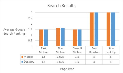
In the graph above, you can see the average rankings of the different types of pages across both the mobile (orange) and desktop (blue) searches. Not only are the mobile sites all nearly even with regard to where they appear in the rankings while the desktop sites finish last every time, but there’s no difference between those searches conducted on mobile devices and those on desktop computers.
The conclusion to draw from this is perfectly clear: mobile optimization is of the utmost importance, and site developers have to take it into account regardless of how much mobile traffic they anticipate. Failing to do so will lead to serious ramifications when users search for your keywords.
June 15, 2015


Craig Lowell
This is some text inside of a div block.